
SENA
SENA
AUDIT AND CONSULTING
Branding Projects // Sakada
SENA
AUDIT AND CONSULTING
Branding Projects // Sakada
The result is a cohesive, modern, and professional brand identity that effectively communicates Sena Networks’ dedication to innovation and reliability in its field.
The result is a cohesive, modern, and professional brand identity that effectively communicates Sena Networks’ dedication to innovation and reliability in its field.
The result is a cohesive, modern, and professional brand identity that effectively communicates Sena Networks’ dedication to innovation and reliability in its field.
Sena Networks is a company dedicated to providing auditing and consulting services. As the company evolved with technological trends and best business management practices, the partners realized the need to update the brand’s visual identity to align with its modern, professional approach.
Sakada was enlisted to assist with the redesign, helping to structure and strengthen the company’s entire communication strategy. The logo was transformed to be more modern and elegant, using a color palette of blue, black, and gray, which could be applied in solid tones or gradients. These colors, previously chosen by the client, were selected to convey credibility and professionalism—key attributes in the fields of auditing and consulting. The letter “S” from the word “Sena” was adopted as the brand’s symbol, offering a clean, recognizable mark that works seamlessly for social media and various materials.
CHALLENGe
CHALLENGe
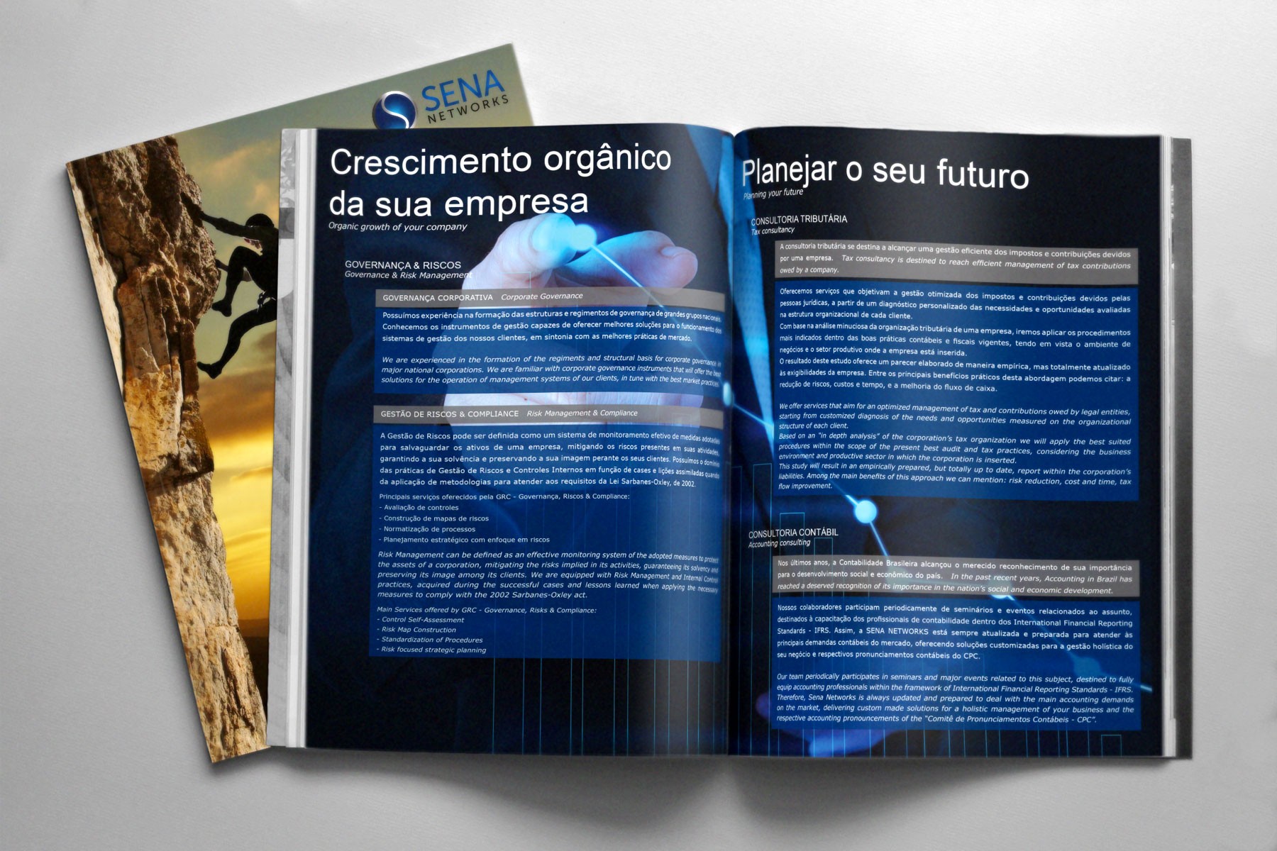
We created a comprehensive range of stationery for the brand, including folders, banners, promotional sheets, business cards, and envelope seals. Each item was carefully crafted to maintain a consistent and polished brand presence across all communication channels. The stationery elements were designed to ensure that the brand’s identity remained unified and easily recognizable across different contexts.
The updated logo, color scheme, and supporting materials now align with Sena Networks’ business values and vision, ensuring the company stands out as a reliable, forward-thinking partner in its field. Through this visual transformation, the brand has successfully strengthened its position in a competitive market, while maintaining a timeless, professional image that appeals to its target audience.
SOLUTION
SOLUTION


