PONTOS
PONTOS
CORPORATE SHIATSU
Branding Projects // Sakada
PONTOS
CORPORATE SHIATSU
Branding Projects // Sakada
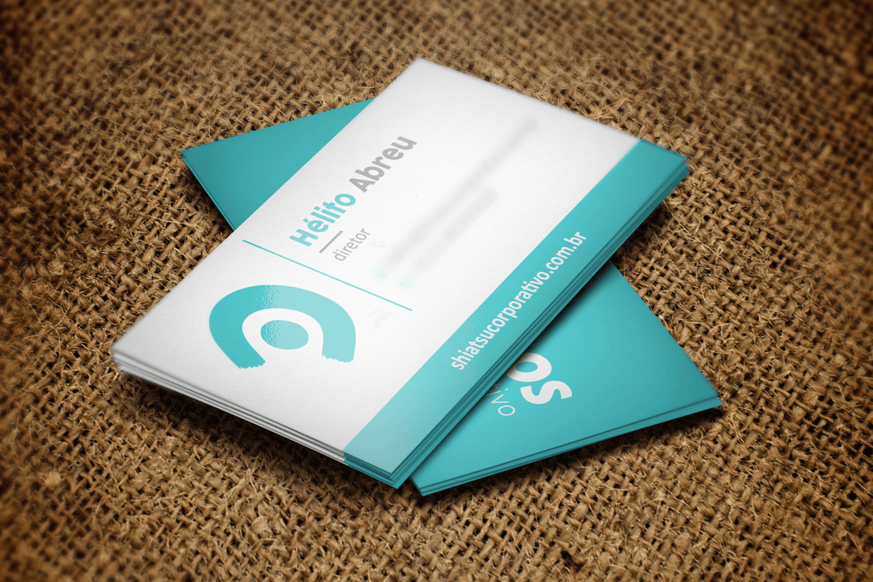
The visual identity project was developed in full, including the naming, logo, business cards, client presentations, letterhead, email signatures, and website.
The visual identity project was developed in full, including the naming, logo, business cards, client presentations, letterhead, email signatures, and website.
Hélito Abreu, leading the brand “Shiatsu Corporativo,” sought a brand identity that authentically represented the Shiatsu technique while aligning with the corporate market. The challenge was
to balance the therapeutic nature of Shiatsu with a professional and modern image that could appeal
to businesses valuing employee well-being, without losing the essence of the service provided.
Hélito Abreu, leading the brand “Shiatsu Corporativo,” sought a brand identity that authentically represented the Shiatsu technique while aligning with the corporate market. The challenge was to balance the therapeutic nature of Shiatsu with a professional and modern image that could appeal
to businesses valuing employee well-being, without losing the essence of the service provided.
Hélito Abreu, leading the brand “Shiatsu Corporativo,” sought a brand identity that authentically represented the Shiatsu technique while aligning with the corporate market. The challenge was to balance the therapeutic nature of Shiatsu with a professional and modern image that could appeal to businesses valuing employee well-being, without losing the essence of the service provided.
CHALLENGe
CHALLENGe

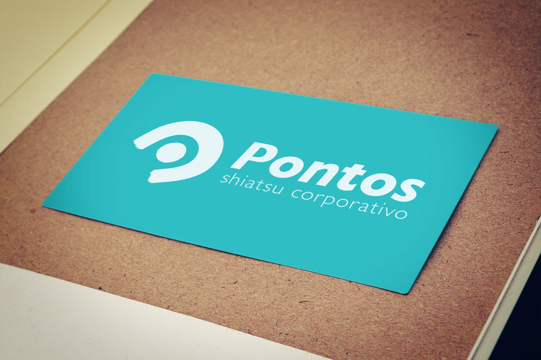
Sakada proposed a name change for the brand to something shorter and more impactful. After a creative brainstorming session, the name “Pontos” was chosen, which directly relates to the Shiatsu technique, focusing on the energy points in the body. “Shiatsu Corporativo” was retained only as
a tagline to emphasize the corporate nature of the service. The visual identity project was developed in full, including the naming, logo, business cards, client presentations, letterhead, email signatures, and website. The creation of a conceptual design, representing the pressure of fingers and hands on the body, was crucial in establishing a visual connection to the therapeutic practice, conveying the idea of balance and relaxation. Additionally, Sakada introduced Shiatsu into its own universe, offering relaxation moments for the team, further strengthening the relationship between the service and well-being in the corporate environment..
Sakada proposed a name change for the brand to something shorter and more impactful. After a creative brainstorming session, the name “Pontos” was chosen, which directly relates to the Shiatsu technique, focusing on the energy points in the body. “Shiatsu Corporativo” was retained only as a tagline to emphasize the corporate nature of the service.
The visual identity project was developed in full, including the naming, logo, business cards, client presentations, letterhead, email signatures, and website. The creation of a conceptual design, representing the pressure of fingers and hands on the body, was crucial in establishing a visual connection to the therapeutic practice, conveying the idea of balance and relaxation. Additionally, Sakada introduced Shiatsu into its own universe, offering relaxation moments for the team, further strengthening the relationship between the service and well-being in the corporate environment.
SOLUTION
SOLUTION