KI!U
KI!U
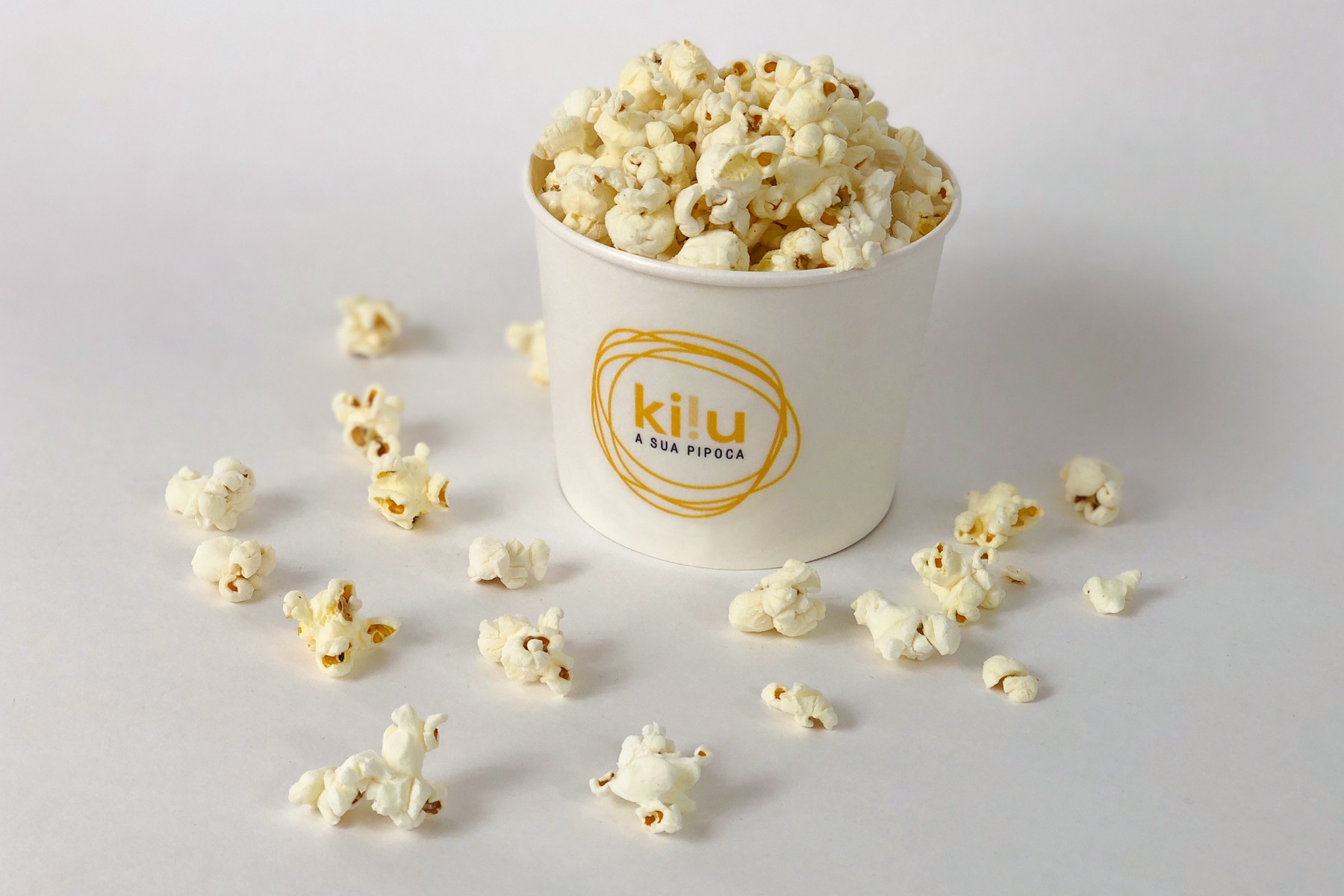
POPCORN
Branding Projects // Sakada
KI!U
POPCORN
Branding Projects // Sakada
Ki!u promises to deliver a flavorful adventure that delights both the eyes and the palate.
Ki!u promises to deliver a flavorful adventure that delights both the eyes and the palate.
Ki!u promises to deliver a flavorful adventure that delights both
the eyes and the palate.
“All the history of popcorn with a pinch of fun and new flavors!” With this creative briefing, we embarked on a journey into the world of popcorn, immersing ourselves in extensive research on the market and its trends. From this deep dive, Ki!u was born—a fun, modern brand offering delicious flavored popcorn to captivate the senses and elevate snack time into an unforgettable experience.
The challenge was to design a brand that would not only appeal visually but also stand out in a competitive market. Our solution started with the creation of a bold and memorable identity. This included developing the name Ki!u, a short and playful expression that embodies the essence of fun and excitement. The visual identity features a vibrant palette of orange and yellow tones, evoking the warmth and energy associated with quick and flavorful snacks.
CHALLENGe
CHALLENGe

To bring the brand to life, we designed a unique and functional point of sale: a fully equipped, stylized tricycle. This innovative mobile unit serves as a production and sales hub, combining practicality with a strong visual impact. From this foundation, we developed a comprehensive branding strategy that included logo design, packaging, print materials, wrapping designs, and promotional campaigns. Prototyping and product testing were integral parts of the process to ensure that the design and functionality met the highest standards.
The packaging was carefully crafted to reflect the playful spirit of the brand while ensuring practicality and usability. Social media campaigns were designed to amplify the brand’s voice, leveraging bold imagery and engaging content to communicate Ki!u’s lively personality.
Every element of the communication strategy was tailored to resonate with the target audience, focusing on creating a fun, youthful, and irresistibly appealing presence..
To bring the brand to life, we designed a unique and functional point of sale: a fully equipped, stylized tricycle. This innovative mobile unit serves as a production and sales hub, combining practicality with a strong visual impact. From this foundation, we developed a comprehensive branding strategy that included logo design, packaging, print materials, wrapping designs, and promotional campaigns. Prototyping and product testing were integral parts of the process to ensure that the design and functionality met the highest standards.
The packaging was carefully crafted to reflect the playful spirit of the brand while ensuring practicality and usability. Social media campaigns were designed to amplify the brand’s voice, leveraging bold imagery and engaging content to communicate Ki!u’s lively personality.
Every element of the communication strategy was tailored to resonate with the target audience, focusing on creating a fun, youthful, and irresistibly appealing presence.
To bring the brand to life, we designed a unique and functional point of sale: a fully equipped, stylized tricycle. This innovative mobile unit serves as a production and sales hub, combining practicality with a strong visual impact. From this foundation, we developed a comprehensive branding strategy that included logo design, packaging, print materials, wrapping designs, and promotional campaigns. Prototyping and product testing were integral parts of the process to ensure that the design and functionality met the highest standards.
The packaging was carefully crafted to reflect the playful spirit of the brand while ensuring practicality and usability. Social media campaigns were designed to amplify the brand’s voice, leveraging bold imagery and engaging content to communicate Ki!u’s lively personality. Every element of the communication strategy was tailored to resonate with the target audience, focusing on creating a fun, youthful, and irresistibly appealing presence.
SOLUTION
SOLUTION