
GREGORIO & FONSECA ADVOGADOS
GREGORIO & FONSECA ADVOGADOS
SIALL CONDOMINIUM MANAGEMENT
Branding Projects // Sakada
GREGORIO & FONSECA ADVOGADOS
SIALL CONDOMINIUM MANAGEMENT
Branding Projects // Sakada
The new identity not only meets the differentiation needs but also reinforces the firm’s image of modernity and trust.
The new identity not only meets the differentiation needs but also reinforces the firm’s image of modernity and trust.
The new identity not only meets the differentiation needs but also reinforces
the firm’s image of modernity and trust.
Gregorio & Fonseca Advogados wanted an innovative visual identity that would differentiate them from competitors in the competitive legal market of Rio de Janeiro.
The partners needed a solution that conveyed professionalism and modernity, aligning with the firm’s contemporary vision while maintaining the credibility and respect that the legal industry demands.
CHALLENGe
CHALLENGe
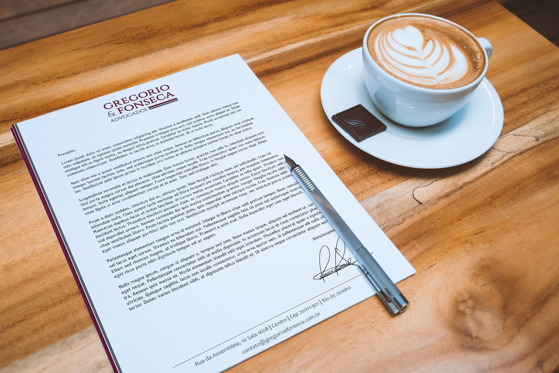
The branding solution involved creating an innovative logo using a semi-serif, modern, and light font that would provide a unique visual identity, while still reflecting the seriousness and professionalism of the firm. The color wine was chosen to convey credibility, elegance, and sobriety—key qualities for a law firm. In addition to the logo, we developed the full visual identity, including complete stationery, such as email signatures, letterheads, folders, and business cards, creating cohesive, high-standard communication for the firm. .
The branding solution involved creating an innovative logo using a semi-serif, modern, and light font that would provide a unique visual identity, while still reflecting the seriousness and professionalism of the firm. The color wine was chosen to convey credibility, elegance, and sobriety—key qualities for a law firm.
In addition to the logo, we developed the full visual identity, including complete stationery, such as email signatures, letterheads, folders, and business cards, creating cohesive, high-standard communication for the firm.
SOLUTION
SOLUTION


