GARBOIS + MELO
GARBOIS + MELO
LAYWERS
Branding Projects // Sakada
GARBOIS + MELO
LAYWERS
Branding Projects // Sakada
The brand needed to be modern, credible, and adaptable to the changing times, seamlessly
fitting into the digital world while upholding the trust and authority built over the years.
The brand needed to be modern, credible, and adaptable to the changing times, seamlessly fitting into the digital world while upholding the trust and authority built over the years.
The brand needed to be modern, credible, and adaptable to the changing times, seamlessly fitting into the digital world while upholding the trust and authority built over the years.
The current crisis has heightened the need for innovation, and with this, we’ve witnessed the accelerated rise of digital solutions across various industries. The challenge was clear: create a brand that could navigate this rapid digital transformation while still maintaining a strong connection to its roots in a traditionally conservative environment.
The current crisis has heightened the need for innovation, and with this, we’ve witnessed the accelerated rise of digital solutions across various industries. The challenge was clear: create a brand that could navigate this rapid digital transformation while still maintaining a strong connection to its roots in a traditionally conservative environment.
The current crisis has heightened the need for innovation, and with this, we’ve witnessed the accelerated rise of digital solutions across various industries. The challenge was clear: create a brand that could navigate this rapid digital transformation while still maintaining a strong connection to its roots in a traditionally conservative environment.
CHALLENGe
CHALLENGe

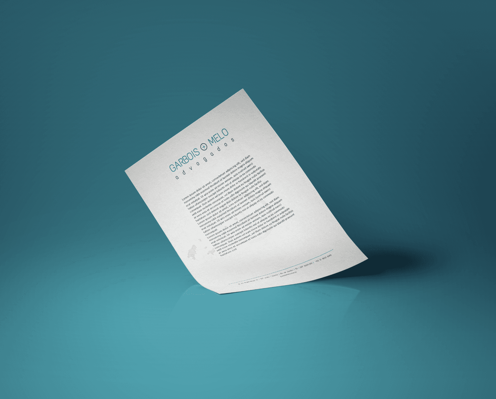
To address this challenge, I proposed a brand identity based on a clean, sans-serif font that would convey modernity and professionalism. The use of straight, simple lines in the typography adds a sense of clarity and precision, reflecting a forward-thinking approach without losing the essence of credibility. Additionally, I carefully selected colors that evoke trust, such as blues and grays, which are often associated with stability and reliability.
One of the most significant aspects of the brand design was the addition of the “+” symbol, which represents both modernity and strength. The “+” became a standout icon in all digital communication, symbolizing a positive, forward-moving trajectory and signifying the connection between tradition and innovation. This simple yet powerful visual cue was strategically designed to make the brand easily recognizable in both digital and physical spaces, making it versatile and future-proof.
SOLUTION
SOLUTION